Is your E-learning GUI Learner-friendly? 10 Examples to Help You Out!

One of the adult learning principles states that adult learners don’t like to be directed, but wish to explore and acquire knowledge themselves. In an eLearning course, the main purpose of the Graphical User Interface (GUI) is to enable learners to navigate seamlessly and tell them ‘where they are’ in the course, how many slides they have completed, how many more do they need to complete and so on. The GUI of a typical online training course contains buttons such as Play, Pause, Replay, Previous, and Next. It also has the progress bar and a menu which contains options to turn the audio on/off, seek help online, access the glossary and resources and exit the eLearning course. Depending upon our requirements, we can skip or add some of the elements described above.
In this blog, I would like to share 10 examples of well-designed eLearning course GUIs.
Example 1
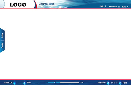
We designed a GUI incorporating the theme of water and sea,for a new employee orientation course. The client is an operator of off-shore rigs.In this GUI, we used the image of the sea as the background and also, we have depicted the Previous, Next, Play, and Audio buttons as droplets of water. We have also included the Script and Index buttons to enable the learner to see the script with just a click. The GUI also had Help, Resource, and Exit buttons besides the Progress Bar. The learner can know ‘where he is’ in the course and how many slides he needs to complete, very easily.
Example 2
For an eLearning course on sustainable development, we designed a GUI using colors of trees. We ‘added greenery’ in the banner and at the bottom of the slide. This gave a good look and feel to the course.

Example 3
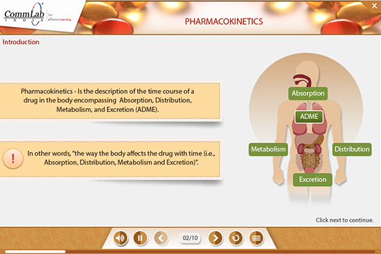
For an eLearning course on pharmacokinetics, we designed a GUI using tablets in the banner. In this GUI, we aligned all the buttons to the center. We displayed slide numbers instead of the progress bar.
Example 4
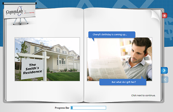
For an eLearning course on a sales process, we have developed a GUI that looked like a book. We used blue and gray colors in the background. We have added the Next, Previous, and Exit buttons as well as the Progress Bar.
Example 5
We designed a GUI for an eLearning course on electrical safety, using an image of electricity pylons in the banner. This was a multilingual course, and so we added a button that allows the learner to select the language of his choice.

Example 6
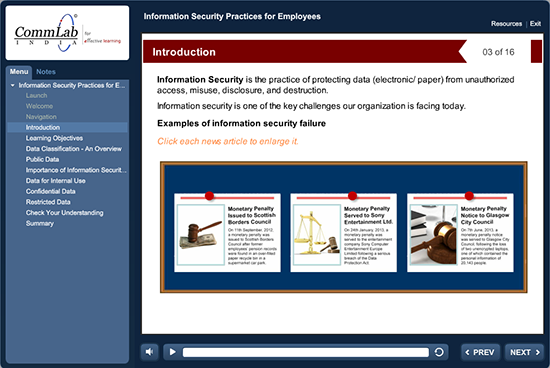
For an eLearning course on information security practices, we designed a GUI in which the menu and ‘Notes’ were added on the left hand side. This helped the learners see the menu and read the script.
Example 7
For an eLearning course intended to train operators of powered industrial trucks, we have designed a GUI in which the menu is displayed on the right hand side. This helps the learners see the menu and title of the screen.

Example 8
For an eLearning course on pandemic influenza, we designed a GUI using a patient’s image in the banner. In this GUI, we have added progress bar to indicate the ‘slide progress’ and ‘module progress’. This helps the learner know ‘where they are in the slide and module’ and know how much is left to be completed.

Example 9
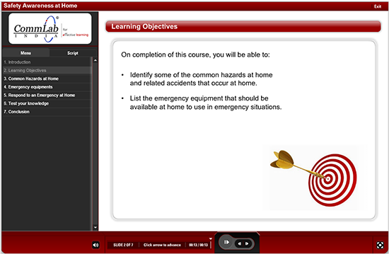
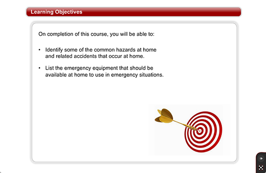
For an eLearning course on safety awareness at home, we designed the GUI in which we added a ‘zoom button’ on the right hand side at the bottom. The learner can click on it to view the full screen.
Example 10
For an eLearning course on lean concepts, we did not include audio. So, we designed the GUI of this course in such a way that we have added a Tip on-screen saying Read the content on this screen then move forward when you are ready.

Usually, a GUI should be designed as per the corporate branding of the organization that provides a similar look and feel for all courses of that organization. I hope you find this blog useful. What are the aspects you consider before designing the GUI of your eLearning courses? We’d love to know.


