Checklist for E-learning Designing

How do you ensure quality in every aspect of eLearning courses? The answer could be that quality can be ensured by a thorough review of each screen. But how do you make sure all the aspects are being reviewed? If the answer is: make a checklist, then you are absolutely right.
A checklist is an important reference tool that consists of a list of parameters that need to be checked in the course to ensure quality. Having a checklist in place maximizes the success of your eLearning course and makes the job a whole lot easier.
→ Download Now: Instructional Design 101
Let’s quickly look at some parameters that could be used as quick reference tools for an eLearning course.
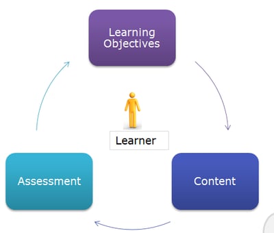
Are the learning objectives-content-assessments aligned?
To shape a good eLearning course, instructional design plays a crucial role in align the learning objectives, content, and assessments on a single platform.
- Create performance-based objectives by referring to Bloom’s Taxonomy.
- Content also differs from one course to other and it may be divided into facts, concepts, principles, process, and procedures. Understanding the content type helps instructional designers to design an effective course and also helps to meet the course objectives.
- Create assessments that demonstrate learner’s achievement of learning objectives.

Are graphics, colors, and font uniform in appearance?
According to the multimedia principle, word and graphics need to be used in a balanced manner.
- Make sure to use single-type visuals throughout. For example, if you are using vectors, use them throughout. Use text and graphics that are legible and clearly defined on a commonly used (1024 x 768 resolution) computer screen.
- Certain colors evoke emotions and convey moods. Use active colors like yellow, orange, red, purple, etc., for highlighting and passive colors like greens, blues and lighter purples are usually preferred as supporting background colors. At least 50% of the screen must be white space.
- Fonts basically should help in distinguishing headings from the body content. Follow instructional design principles for typography by limiting fonts to two. You can use altered styles, such as italics, bold, etc.

Instructional Design 101
A Handy Reference Guide for eLearning Designers
- eLearning standards
- Streamlined instructional design process
- Effective assessments
- And More!
Is audio judiciously used?
According to the Modality Principle, a key concept in instructional design strategies, learners benefit more from animation and narration, rather than from animation and on-screen text. Audio should be used either as a paraphrase that summarizes your onscreen content or as a description to the image or illustration onscreen. If your audio reads the exact words on screen, then your audio may slow down your learners learning pace. E-learning courses should have an audio ON/OFF button and a bar to adjust the volume.
Is the course easy to navigate?
According to adult learning principles, adult learners are self-directed and result-oriented. A course with restricted navigation is usually not a good approach. A good eLearning course should be user friendly and self-directed, which allows users to explore and enhance their learning experience. Required navigational functions should include start, exit, forward, backward, menu, etc.
Is feedback for assessments adequate?
Formative assessments are used throughout an eLearning course and feedback for these assessments should tell learners that they are right or wrong and state the reason for the same. Never give one-liners as feedback. Feedback should be framed in such a way that learners will know why the selected answer is incorrect, and also give a hint to consider a better option. Feedback to the wrong answers should be in a way that it also improves learning.
It can, therefore, be concluded that these parameters need to be followed and implemented as they play a vital role in making an eLearning course effective.


