


This is what we want our learners to feel after finishing a course. But in quite some instances, he or she ends up frustrated with the course, even choosing to leave it midway! Where is the instructional design?

Why does that happen? And how can we avoid that outcome?
Explore ID strategies that help design sticky eLearning experiences.
Instructional Design Errors
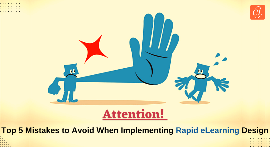
9 common mistakes to avoid in eLearning course design:
- Improper Analysis of Inputs/Content
- Lack of Clear Instructions
- Illogical Flow
- Improper Content Chunking
- Confusing Navigation
- Errors in Grammar and Spelling
- Inconsistent Use of Fonts
- Improperly Labeled Illustrations
- Copyright and Plagiarism Concerns
As an Instructional Designer, it is very important that you ensure your eLearning course is absolutely error-free. But despite our best efforts, things fall through the cracks sometimes and errors creep in.
This blog discusses some common mistakes or oversights that can be easily avoided to develop a ‘perfect’ course. With the right approach and proper Instructional design training, these errors can be minimized effectively., these errors can be minimized effectively.
Common Instructional Design Mistakes to Avoid
1. Improper Analysis of Inputs or Content
Considering its importance, proper and thorough content analysis is the first step to ensure an error free course. This is because you need to see if the given content addresses the set learning objectives. In case there are gaps in the content, they need to be filled with the help of the SME (Subject Matter Expert).
The choice of instructional design models, instructional design strategy and the course duration also depend on the content. When the analysis is not done properly, it leads to a lot of feedback and rework that will affect the team’s morale, and more to the point, have time and cost implications.

Watch how to set clear learning objectives for eLearning courses to ensure thorough content analysis and effective instructional design strategies.
2. Lack of Clear Instructions
Vague, unclear instructions for interactivities, quizzes, or eLearning assessments can confuse learners. This may cause frustration, resulting in the learner skipping the slide or even leaving the course midway. Instructions should be simple, clear, and concise and should aim to guide the learner through the given activity.
3. Illogical Flow
When the content is not presented in a logical manner, the learner finds it difficult to relate the previous slide (or page) to the present one. That increases the cognitive load with the learner trying to figure out the ‘why and what’ of that content. The course (content) needs to flow like a story with each page logically and seamlessly going into the next. Otherwise, the learner is left confused and will also find it difficult to retain and recall that information.
4. Improper Content Chunking
Chunking is a method of presenting information by splitting it into small pieces or “chunks”, making learning easy, manageable, and improving understanding and retrieval of information. Content chunking is especially needed when there is a lot of content related to one learning point or topic that needs to be shown on a single screen. Heavy on-screen text increases cognitive load and overwhelms the learner. Also, the devices on which the eLearning is accessed have limited screen dimensions. As scrolling is not recommended, chunking is needed to present all information accurately on the screen.
Chunking helps:
- Convey information more efficiently
- Guide learners to focus on the key points on a screen
- Present information consistently from page to page
- Emphasize ‘need to know’ topics
Here’s an example of content before and after chunking.

The first step in content chunking is to identify ‘need to know’ and ‘nice to know’ content.
- ‘Need to know’ information is essential for the learner to achieve the learning objectives and has to be presented on screen.
- ‘Nice to know’ information helps learners deepen their understanding (through detailed explanation, examples, etc.) and can be shown in resources or on click.
Course level chunking helps divide the content into topics or units, after which screen level chunking is done. Here, the content is chunked into individual screens based on the ‘learning point’ of that screen. A ‘learning point’ is one chunk of learning that cannot be broken down any further. If the learning points are very small, you can present more than one ‘learning point’ in a screen but take care to limit them to 3-5 ‘learning points’ per screen.
5. Confusing Navigation
Navigation is one of the most important factors that can increase the learner’s comfort level with the course. But many a time, learners find it difficult to navigate through the course, de motivating them to continue till the end. Making the navigation intuitive and providing user-friendly directions in a course allows them to explore and learn and enhances their learning experience.

The Course Map or Menu should display features that help orient the learner within the course content (‘where the learner is now’). Functional tracking features should accurately document course sections, units, modules, etc. that have been started or completed by the learner (‘where the learner has been’). This is done through checkmarks, the progress bar, and the screen counter functions. The navigation should allow the learner to start the course, exit it, move forward or backward, and return to the main menu when needed – all without feeling confused or stressed out.
Watch how to create intuitive, user-friendly navigation that enhances the learner's experience and keeps them engaged throughout the eLearning course.
6. Errors in Grammar and Spelling
Perfect grammar and usage are expected in an eLearning course. However, typos and errors may sometimes be missed leaving the learner with a bad impression on the course. Grammar and spelling mistakes can be easily avoided by doing ‘spell check’ and checking usage in case of doubt.
Let us look at a funny example where the lowly comma makes a huge difference to the meaning of the sentence.

See what I mean?
7. Inconsistent Use of Fonts

Seeing different fonts in different pages can be annoying and be a source of distraction for the learner. (Of course, this does not hold true for videos that aim to attract.) Ensure font style and size are consistent throughout the course. This can bring uniformity and a sense of reliability to the course. Some best practices:
- Ensure consistency in fonts.
- Use only three fonts throughout.
- Use contrasting background for the fonts.
8. Improperly Labeled Illustrations
Visuals are very important in any eLearning course, and it is necessary that illustrations are positioned and described in sync with the content. Wrong labeling can ruin the course and make it harder for the learner to understand what you’re getting at.
9. Copyright and Plagiarism Concerns

Copyright is another important concern in eLearning as it not only affects the course but also your organization. Plagiarism means using content or images that do not belong to you. It is best to develop your own content or illustrations. There are sites that provide images and illustrations that you can purchase and safely use in your courses (iStock, Shutterstock, etc.). Instructional design tools often integrate plagiarism-check features or resources, ensuring your course remains original and compliant.
Final Thoughts
These are a few errors that might seem insignificant, but when not taken care of, may become major hurdles in the course. So, steer clear of the afore-mentioned errors and voila, you will be able to create perfect eLearning content.
And if you are keen to master the instructional design even more to ensure higher engagement for your learners, then browsing through this eBook is a must for you.

![A Checklist for Every Instructional Designer [Infographic]](https://blog.commlabindia.com/hubfs/blogs/checklist-for-instructional-designer-infographic.png)
![5 Mistakes to Avoid in Rapid eLearning Design and Development [Infographic]](https://blog.commlabindia.com/hubfs/blogs/rapid-elearning-mistakes-avoid-infographic.jpg)