
White space draws attention to the content and has a soothing effect on the eyes. But what do you understand when I say using white spaces in an eLearning course?

How do you feel about the picture given below? What feelings does it arouse? Do you feel happy or may be grumpy? Irritated? My brain was sure overloaded when I looked at it. All I wanted was some breathing space!!
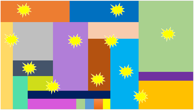
Well! You don’t need to be a graphic designer to guess the problem with this image. But still, if you know the rules of graphic designing, you will say the one thing sorely missing here is white space. The image is overloaded with flashy colors that can irritate our eyes.
→ Download eBook: Instructional Design Strategies - How Create Compelling elearning?
White space draws attention to the content and has a soothing effect on the eyes. But what do you understand when I say using white spaces in an eLearning course? Now that we know white space gives you mental space and pause, you will rarely listen to someone saying “I think, I would rather take an eLearning course that gives me some space.”
Here are a few points that show how important white space is in eLearning.
Makes the learners feel at ease:
Providing white space makes the screen pleasant and lends a calming effect. It creates a level of comfort and helps the learner focus on the content. They aren’t attacked with confusing and extravagant choices for viewing the content.
Provides a balanced environment:
According to the principles of graphic designing, each empty space on a screen has a purpose. Using them judiciously will create a balanced presentation for the content. You always need to make sure you don’t use it too much, as this can confuse learners.

Instructional Design Strategies to Design Engaging eLearning Courses
Design Learner-Centric eLearning
- Importance of ID Strategies in eLearning
- Parameters to Select the Right ID Strategy
- ID Strategies for Effective Results
- Case Studies
Boosts readability for learners:
Providing balanced white space on the screen will make it easy for learners to scan and absorb content quickly. It is said content with more white space between the lines becomes more learner-friendly rather than cluttered content.
Makes an impression on the learner:
Learners take hardly 5 seconds to look at the screen and judge. If they find the screen too heavy or confusing, it is possible they get demotivated and may also try to skip screens and wind up the course as quickly as they can.
Some quick tips to help you use white space effectively in your courses:
- Ensure spaces between images and paragraphs to help focus on content
- Use line spacing appropriately to boost readability
- Apply the principle of balance to create designs for your screen
- Try to understand symmetry and create a balanced design
When we design courses for our eLearning courses, learners should make sense of it and never get overloaded with the elements.
Hope this blog will be useful to you the next time you think of designing screens.


![4 Benefits of Using White Space in E-learning [Infographic]](https://blog.commlabindia.com/hubfs/Imported_Blog_Media/whitespace-in-elearning-infographic1.jpg)