How to Make Your E-learning Course Responsive on Multiple Devices?

With augmentation of mobile workforces, organizations have now realized the need to design and develop eLearning that adjusts itself to the varying screen sizes of different devices. This is called responsive eLearning where a single version of the course is developed in HTML5 and can be accessed on any mobile device.
But the eLearning courses that are published in HTML5 using rapid authoring tools are not responsive to mobile devices. In order to make an eLearning course that is responsive on all devices, you should have a good command on HTML5, CSS3, Jquery (UI), and Javascript to understand the course layout structure. Recently, we have developed a course in Lectora, to make the course responsive on all devices; we took the source code of the published course and replaced it with the languages mentioned earlier. With this, the GUI of an eLearning course that includes, client branding, learning content and navigation will adjust to the varying screen size.
Let’s see how to develop eLearning courses in Responsive design:
Step 1
Take a published eLearning course.

Step 2
Run the course in any browser to understand the course layout design and course functionalities.
Step 3
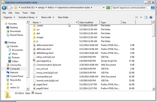
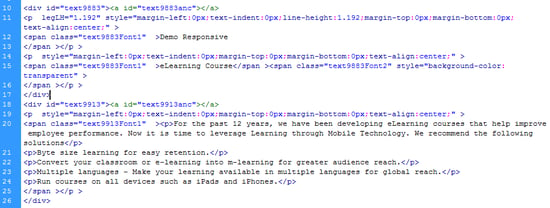
Now open the source files in HTML editors like Notepad++, PSpad, and Adobe Dreamweaver.
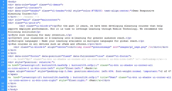
If you wish to convert these functionalities to responsive design you should write HTML5 tags using jquery data-roles and CSS3 classes.
Open the file in html editor, remove the old content area, and now give your own code in the content area without disturbing functionalities and tracking.
- Remove the page DOCTYPE code on first line <!DOCTYPE html PUBLIC “-//W3C//DTD XHTML 1.0 Transitional//EN” “http://www.w3.org/TR/xhtml1/DTD/xhtml1-transitional.dtd”>
<html xmlns=”http://www.w3.org/1999/xhtml”> - Now add the new tags <!DOCTYPE html> <html lang=”en”>
- Add the meta tag code in header inside <meta name=”viewport” content=”target-densitydpi=device-dpi, initial-scale=1.0, user-scalable=no” />
- Add the external css files and jquery files in header tag.<link rel=”stylesheet” href=”css/jquery.mobile-1.4.0.min.css”>
<link rel=”stylesheet” href=”css/custom-demo.css”>
<script src=”js/jquery.js”></script>
<script src=”_assets/js/index.js”></script>
<script src=”js/jquery.mobile-1.4.0.min.js”></script> - Find original content in file.

Now add the new CSS styles and jquery data-roles instead of old content and without disturbing old functionalities.

Now run the courses on the browser to check if the course is responding on the device or not.
Here are the sample screenshots that are responsive on the various devices.

Scroll to view full image
I hope you found this blog useful. Do share your experience, if you have tried responsive eLearning.


