
Adapt a responsive design approach to fulfill the needs of your millennial employees.
D uring the inception of e-learning, the number of devices on which employees took the online courses was fairly limited. So, developers used to fine-tune the course according to the kind of computer it would run on. These type of courses are termed as non-responsive, and they are designed to work flawlessly on a single device or, at best, a device class.
With the boom of mobile devices in the early 2000s, this non-responsive course development approach proved to be highly inadequate. Mobile devices not only came in an array of different screen sizes, but also ran varying operating systems and web browser software. This made fine-tuning courses for individual devices impractical and called for a new approach for designing e-courses. Responsive design emerged as a strong solution to tackle these challenges.
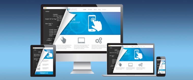
Responsive Design is a development approach of creating content that allows for an optimal user experience across a wide variety of devices, including phones, tablets, and desktop devices. The e-course dynamically adjusts itself according to the device in use, giving the best possible content experience on each device. As the number of mobile devices keeps increasing, along with their relevance in our lives, a responsive design approach is clearly the way ahead. Let’s see how responsive e-courses can future-proof your training program:
New World, New Ways
Mobile devices as powerful as a computer, and combined with high speed Internet, have changed the pace of people’s lives. On top of this, it is becoming increasingly common for people to own multiple devices for their personal and professional use. Everything that happened on a computer, is now shifted to a mobile device, including the way people learn.
In this new mobile-world, people are going to undertake an e-learning course on multiple devices, in different situations and locations. Adapting a responsive design approach will ensure a flawless learning experience on each device, which integrates learning into the dynamic lifestyle of a millennial generation.
Easier Development
Responsive design essentially means developing one single master course that runs equally well on all your target devices. This significantly reduces development cost and effort as you only need to produce just one deliverable. Instead of having to worry about the specifications for various devices, developers can focus on creating courses that are more impactful. Since you just have a master course to worry about, handling the entire learning program becomes less resource-intensive and allows you to do more with less.
Seamless Deployment and Maintenance
In case you have multiple versions of the online training course for different devices, then you will have to update each one of them individually. However, if you create your online course using responsive design, you just have to modify your master online course and deploy it on every device. The same principle applies to fix course glitches or errors.
Rather than having to correct a myriad of different course versions, you just have to fix the issue once for it to reflect everywhere. When you have just one version of the course, creating, tracking and distributing online training programs becomes very easy.
Better Learning
Responsive design ensures that your courses look, feel, and function efficiently across any possible device. For employees who might complete different portions of the course on different devices, this proves to be a boon. When a course gives users the best experience right on their smartphones, they are motivated to engage further in their quest for knowledge. A bad learning experience on the other hand pushes learners away, while a good one prompts them to come back for more.
Make the Most of the Training Budget
If you combine all of the above factors, you will realize that a responsive course design helps you make the most out of your training budget. Easier development, deployment, and maintenance gives you huge savings on your training budget. A better learning experience means that employees are well-equipped with the right information. It also means that employees do their duties more accurately, which increases productivity, which in turn increases the profitability of your company.
Responsive design clearly secures the future of your training. It makes e-learning development financially sustainable, while increasing the practical impact of the training. Adapt responsive design and increase the shelf life of your e-learning courses.