
This blog highlights the features of Adobe Captivate that are helpful in developing responsive eLearning that works on multiple devices.
The exponential growth in telecommunications resulted in mobile revolution and we ended up with several devices of various screen sizes. According to Gartner’s study, more than 50% people will use mobile devices first for their online activities by 2018. The trend of using more than one device at work and using personal mobile devices for work-related activities has prompted the training community to design and develop device-agnostic Learning.
That’s when responsive design came into the picture. Adobe Captivate has quickly adapted to the changes and integrated responsive eLearning authoring features so that learners can take the courses on all devices. So, let’s see what features have helped Adobe Captivate develop stunning responsive eLearning courses.
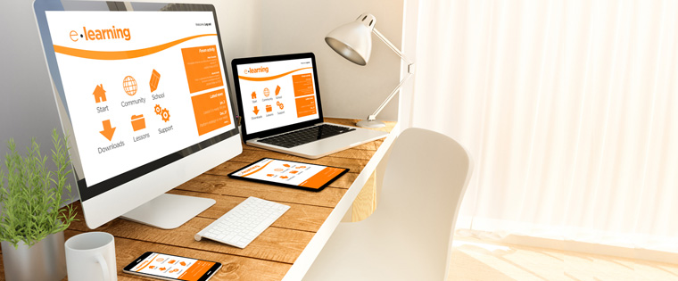
1. Single Course for Multiple Devices
In Adobe Captivate, you have a provision to develop courses to be displayed on multiple devices by tweaking the desktop version. You don’t have to take the pain of creating different versions of the same course for various devices.
The good news for you is, from a single course, you can develop multiple versions without rework. You have a facility to develop a single course with at least five versions from the beginning, i.e. for desktops & laptops, mobile portrait, mobile landscape, iPad portrait, and iPad landscape in Captivate. If you have any other devices of different screen sizes, with the help of breaking points, you can set the custom portrait and landscape modes in this authoring tool. This offers the convenience of developing a course for multiple devices at once without wasting much time, resources, and avoids huge rework.
2. Responsive Screencasts/Simulations
Screencasts or screen captures play a vital role in developing simulation-based software training and Adobe Captivate is known for that. It creates fully responsive and high definition screencast simulations with all interactive features. Captivate automatically detects the device to render the screencast to be auto-fit to its screen. You can record screencast simulations in various modes such as Demo, Assessment, Training, and Custom in a single take. This can be done in a hassle-free manner.
Captivate adds click boxes, text entry boxes, captions automatically and provides an option to change them wherever you want. This facility saves your simulations recording time and the output is fully responsive that is adaptive to multiple devices.
3. High Quality HTML5 Output
To make your online courses mobile compatible, Adobe Captivate renders HTML5 output. You can publish the entire online course in HTML5 format after the development. Captivate allows defining a range for the size of each object so that it can prevent re-scaling of views across multiple devices. This helps to ensure pictures, objects, videos, and animations are displayed clearly on all digital devices.
4. Gesture-enabled Learning
The responsive eLearning courses developed using Adobe Captivate help facilitate gesture-enabled learning on various devices. This enables effective learning interactions on all touchscreen devices irrespective of their screen sizes. This helps your learners navigate through mobile learning courses easily using their fingers. It gives the convenience of tap, pinch, zoom, scroll, and swipe actions on multiple devices with various screen sizes.
5. Responsive Theme Templates
Choose from an array of responsive theme templates from Captivate’s library to develop readymade eLearning courses that work on all devices irrespective of screen sizes and orientations. The responsive themes are flexible for customization as per your training requirements or you can create your own.
6. Responsive Motion Effects
Responsive motion effects facility in Captivate helps create fluid object transitions that include motion paths and rotations in responsive eLearning courses. Motion effects can be added to both specific objects and groups of objects. You can also define linear or custom motion paths to control the object movements completely. ‘Hover to preview’ mode helps see how the animation effects play in the course. Designing various motion effects for different devices ensure superior responsive learning experience for your employees/learners.
7. Responsive Interactions
Develop responsive interactions such as drag-and-drop, click-on-tab, click-on-images, and to add the fun element – game themes, gamified quizzes/assessments that can work on all devices. You can customize the default interactions to enhance the visibility and touch on mobile devices.
So, make the best use of these features of Adobe Captivate to develop highly responsive eLearning courses that work on multiple digital devices. All the best..!!