
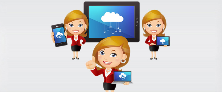
Here are a few ways to develop multi-device compatible e-learning. Read on to learn more.
We use multiple devices (laptop, desktop, tablet, and Smartphone) in a single day according to our choice and availability. So, if you want your e-learning courses to be available to your employees, no matter which device they use, you can create one course for each device you want to deliver on. But it’s quite expensive and time consuming. To minimize these issues, adopt Responsive Design. What exactly is responsive design?
Responsive design is a single version of a course delivered across multiple platforms or devices. It is easy to track and maintain, access and search content, and allows sequential screening.
Here are a few ways to develop multi-device compatible e-learning. Please check it out.

![Popular Ways to Develop Multi-device Compatible E-learning [Infographic]](https://resources.commlabindia.com/hubfs/Imported_Blog_Media/Most-Popular-Ways-to-Develop-Multi-device-Compatible-E-learning.jpg "Popular Ways to Develop Multi-device Compatible E-learning [Infographic]")
Hope you like it.