10 Learning Design Tips for Mobile Learning
Want to deliver effective mobile learning for your employees, consider these learning design tips which might be helpful for to deliver valuable learning experiences.

Is your organization using mobile devices to deliver effective trainings for your employees? According to Towards Maturity survey, 47% of businesses and other organizations already use some sort of mobile devices for training and e-learning activities.
It is a well-known fact that mobile technology is on the rise and many organizations are now considering mobile learning because of its numerous advantages. They think that e-learning is very similar to mobile learning and it’s all about just adopting existing e-learning course content into m-learning.
Have you ever adopted your existing e-learning course content that was actually designed for computer-based training into an m-learning course? If the answer is yes, what was the overall user learning experience?
Viewing e-learning course on a desktop computer is a different user experience to viewing it on a mobile or tablet. So, if you want to deliver effective mobile learning for your employees, consider these learning design tips which might be helpful for you to deliver better learning experience. Let’s have a look at the tips.
1. Minimize the GUI functionalities
Design the GUI with minimum functional elements such as Home, Previous, Next, Cancel, Submit, and Exit buttons because of the small screen size. Place the Submit and Cancel buttons far away from each other to minimize learners clicking the incorrect button and leave a lot of space around the buttons.
Make sure that these buttons are bright, highly visible, and large enough for the learner to easily operate the mobile device with a single finger and in the standing position.
2. Divide the course into multiple modules
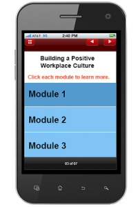
Divide the course into multiple modules and try to keep them very small in size, maximum 10-15 minutes each. For example, a one hour course can be divided into 6 byte-sized modules because short modules capture learners’ attention and make them stay on till the end. Deliver only a single learning objective or leaning point per screen when you divide the course into modules.
3. Offer small nuggets
Offer small nuggets by breaking the content into small digestible units without losing its intended meaning because probably learners won’t sit for hours to take up a full-blown m-learning module on a phone. They just want to have just-in-time knowledge during their downtime to retain only essential information.
These small nuggets will help learners’ remember the information for a longer period of time and help them reduce cognitive load.
4. Replace long text with audio
Before replacing long text with audio, analyze who the target audience are and in which environment they will access the course. For example, you can replace large volumes of text with audio, when learners access the courses in reasonably quiet surroundings. If the employees are working in a factory shop or noisy surroundings, having audio for the course may not serve any purpose.

5. Avoid complicated graphics and background images
It is recommended to avoid complex graphics for mobile learning because of its small screen size. It is better to maximize the use of images and icons to present the content instead of complex graphics. Provide visual cues such as descriptive icons, explanatory images, and meaningful colors (for example, green for advantages/Dos and red for disadvantages/Don’ts), etc.
Avoid background images and patterns as they might distract the learners’ attention from the course and clutter the mobile screen space.
6. Minimize scrolls
Generally, mobile learners do not wish to go through lengthy text as it leads to scrolls. It is highly recommended to avoid scrolls as they can be more difficult on an average-size mobile phone. This could be done by breaking-up the content for multiple screens with a bright “Next” button or providing the “Nice to know” information within a “More Info” button, so that the learner need not scroll a lot.
If there is no way to avoid scrolls, use vertical scrolls rather than horizontal scrolls as the height of a mobile screen is more than its width.
7. Design for a single hand
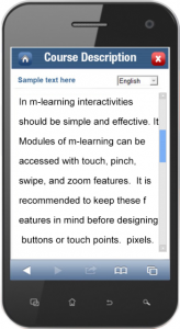
It is known fact that most of the users use their mobile devices with a single hand and use their thumb to navigate through the screen while standing or moving in a bus/train or while holding something else in the other hand. So, consider a single hand and the thumb while designing the m-learning modules. The average width of the adult thumb is 25 mm (1 inch), which equates to 72pixels (Wikipedia).
8. Use simple interactivities
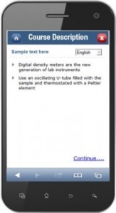
It is recommended to avoid using complex interactivities as it confuses the learners. Try to use simple interactivities that engage the learners, for example, click on tabs, images, or icons, rollovers, hotspots etc. can be used for effective mobile learning.
Keep the mobile screen size in mind before designing such interactivities and buttons because most of the mobile users access their phones with click, touch, pinch, swipe, and zoom features.
9. Keep animations short
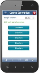
Animations should be short and no longer than 3 minutes because learners interact with their devices for a shorter period of time when they are on field.
It is recommended to avoid complex animations that take a lot of time to load and are not clearly visible on mobile screens.
In m-learning, short animations work better than videos because they engage learners and help them retain the information for a longer time.

10. Keep quiz questions short
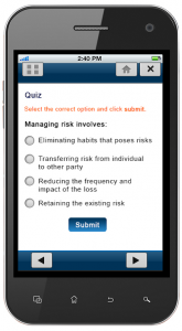
Frame assessments based on learning objectives and ensure they are short and simple. It is recommended to restrict the options to two or three and provide immediate explanatory feedback to learners instead of just saying correct or incorrect.
True/False, single select, multiple select questions would be the ideal options to use in mobile learning because they allow us to easily evaluate the learners’ performance on the Learning Management System (LMS).
Keep the mobile screen size in mind while designing your next m-leaning course and follow these effective learning design tips to engage learners throughout the course.


