
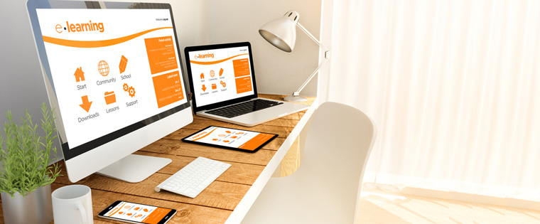
Explore the power of Adobe Captivate for creating responsive e-learning courses.
Gone are the days when employees rigorously sat at their desktops to undertake an entire e-learning course. This is a dynamic era. Employees are constantly on the run chasing clients or targets, leaving them little time to dedicatedly sit and learn. Instead, they choose to take their learning with them.
Using multiple mobile devices such as smartphone or tablets, this millennial generation prefers to learn on the go. Mobile devices enable e-learning courses to be accessed anywhere, anytime, giving learners the true power of flexibility. When employees get to learn according to their own convenience, they display a greater willingness to undertake the course. This translates to better absorption of knowledge and greater interest in the subject matter. Consequently, this boosts their skills levels and makes e-learning a top priority for them.
But, what if your e-learning course isn’t able to keep up with these dynamic times? What happens when course doesn’t work equally well on the multiple devices of a user? Non-responsive courses don’t sit well with today’s generation. Non-responsive courses might throw up unexpected glitches or misplaced course elements or hampered functionality on various devices. This inconsistent experience puts users off and reduces their drive to learn.
But it doesn’t have to be like this. Use Adobe Captivate 9 to create highly responsive courses that can make training interesting as well as a priority for learners. Below are some of the key responsive features that Captivate brings to the table and enhances your e-learning experience:
Adobe Typekit Integration
With the integration of Adobe Captivate with Typekit fonts, you don’t have to limit yourself to web-safe fonts in your responsive e-learning projects. This integration will help you access beautiful fonts from the Typekit font library through the cloud. It provides an optimal and consistent viewing experience across any device, ensuring your onscreen text always looks like the way it should be. Click here to know more about this useful feature.
Fluid Boxes
Creating responsive e-learning courses has never been so easy. With the introduction of Fluid Boxes, you don’t have to worry about how your content looks on various devices.Fluid Boxes are containers that hold objects (text and graphics), enabling you to use white space more intelligently. These containers kick-in when you choose a responsive theme.
Optionally, you can draw your own Fluid Boxes. Objects placed in Fluid Boxes are aligned automatically so that learners always get a fully responsive experience, regardless of their device or browser. This new feature saves a lot of time and efforts in e-learning development while creating a true responsive e-learning experience.
Convert Legacy Courses into Fully Responsive E-Learning
Join the mobile age. Transform legacy desktop-only courses to fully responsive modules using the latest technology from Adobe. Bring in existing Adobe Captivate projects and save them as responsive projects in just a matter of clicks. When you relaunch them, Fluid Boxes will automatically appear around the most logical grouping of objects, which you can accept or customize.
Device-Specific Previews
Eliminate the guesswork of how your course will look on various devices. Now you can use device-specific previews along with the Responsive slider to see how your e-learning content will look on different devices before you finally publish it. Select the specific device from the preset device menu to see the output.
You can also drag the responsive slider to see how the e-learning content aligns for varied screen sizes, right away in the authoring environment itself. You can even make a custom size and add it to the list of device-specific preview.
Scalable Vector Graphics (SVG)
You can create high-quality projects with vector images that scale across devices and sizes with no loss of quality. Define complex shapes and bring them into Adobe Captivate, as SVG graphics. Convert them to auto shapes and use them as buttons or feedback captions. Images are automatically added to the library, and can be reused across projects.
Responsive Text Support
This feature allows you to provide a superior learning experience for text-heavy courses delivered on small screens. Long paragraphs are automatically collapsed to just a couple of lines. These lines can give learners a brief intro of the topic. But if learners are further interested and want more information, they can click to view more.
Adapt a responsive design for your e-learning course and make it ready for a new dynamic generation. Even if you have old e-learning courses, convert them to responsive and renew the interest of your employees in the digital learning program. By giving employees a flawless learning experience, you ensure that the e-learning course successfully imparts practical skills among users. This will make learning a top most priority for your employees.
