
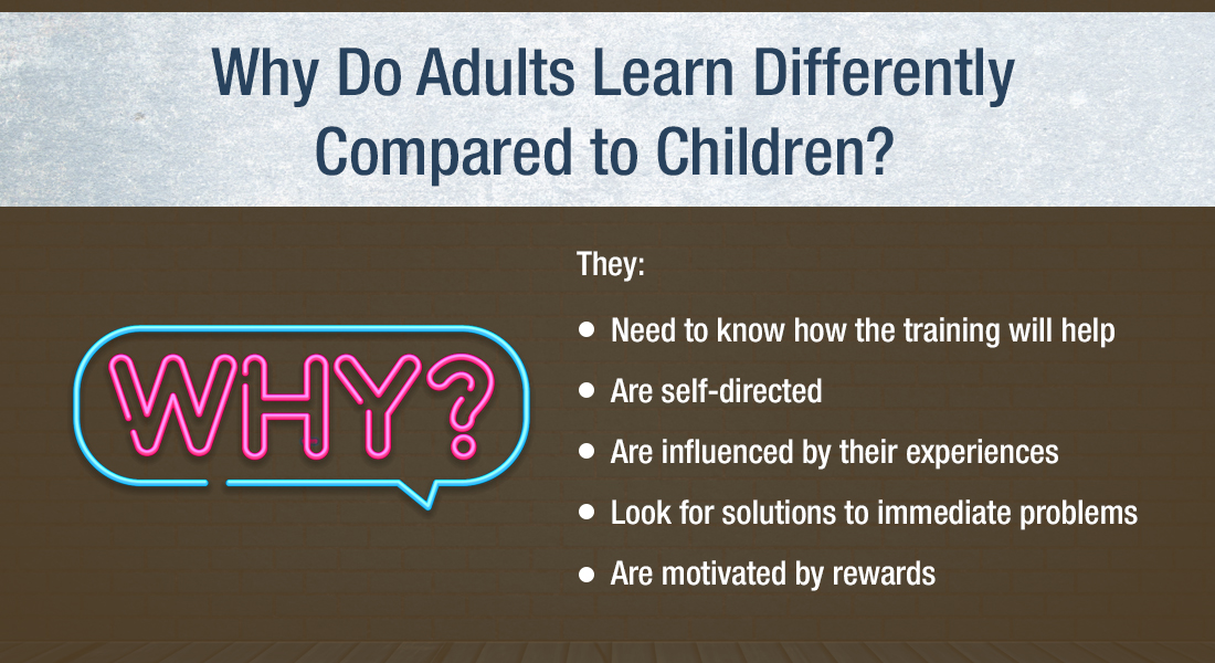
Training managers and L&D professionals can understand the importance of following responsive course design in online training programs.
As I write this blog, I am wondering how you will read this. Maybe you are sitting at your desk looking at a laptop screen or tapping away on your smartphone or swiping your iPad while commuting to work. The only way to ensure that you see these words as I do is to ensure that my blog site follows a responsive design. The same applies to online learning solutions designed for corporate training. If you are involved in training or L&D in your organization, you need to be aware of the benefits of implementing an online training program that follows a responsive design. Read on to get an insight into the significant benefits of responsive course design.
Increased Audience Reach
Thanks to the increasing number of millennials in today’s workforce, the Bring Your Own Device (BYOD) policy in corporates has boomed in recent years. According to a survey by Tech Pro Research, 74% of organizations in the US are using or planning to allow employees to bring their own devices to work.
Every organization demands a cutting-edge learning experience that supports anytime, anywhere learning. Learners might switch from a large desktop monitor to a palm-sized mobile screen in order to complete their online training. A responsive course design supports multi-device learning.
Seamless Content Flow and Navigation
Can the content viewed on a PC screen present itself in the same way on a smartphone screen? The answer is an obvious, ‘No’.
Responsive design offers optimal viewing experience on different devices. The content automatically flows to fit into the layout of the target environment.
Responsive course design lets learners swipe, slide, pinch or shake the mobile device screen in order to navigate through the course effortlessly.
Reduced Development Cost
Imagine a scenario where employees in your organization use different devices to access training content. You could design different versions for the same e-learning program to suit different devices or you could design one responsive course to automatically adapt to different screen sizes and resolutions of multiple devices. Which one would you opt for?
Without a doubt, you would opt for the latter, as designing one course for multiple devices is advantageous in terms of time and money.
Future-Ready Content
The training team is responsible for getting courses updated to reflect the latest information. For example, if you have an online product training course, it might need to be updated to include the latest version of the product. In order to keep up with changing compliance regulations, an online compliance training needs to keep pace with the latest changes. If the online training program does not have a responsive design, updating the course content would be difficult. A responsive online learning solution paves the way to future-proof content.
Single Point of Distribution
The Learning Management System (LMS) has the task of creating, tracking and distributing online training programs. When you have one version of the training program that works well for multiple devices, distribution of the course becomes easy. A learner can complete part of the training on a laptop and choose to complete the training by accessing the course on a smartphone. Even when the learner has switched between devices, the course completion is tracked effectively by the LMS when a responsive design is followed.
A responsive course design empowers learners to choose the device of their choice to complete the training. Although designing a responsive course might take more time, as it requires testing to check that it works well across different devices, it is definitely worth the investment.
Please use the comments section to share the benefits of implementing a responsive course in your organization.