
This post is a case study of how a telecommunication giant converted 500 legacy courses to responsive design, within 60 days.
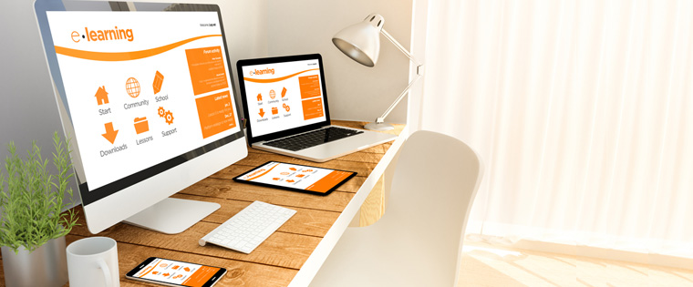
With the phenomenal growth of devices such as smartphones and tablets, learners now access information from different devices and browsers. A study by Google revealed that 98% of Internet users switch between devices with varying screen sizes, in a single day.
This means that to best support their learning experience, our e-Learning courses must work well regardless of the device they may be using at a given time. The same content that they have access to on one device must be present when they return on other devices, to ensure consistency in the information they are seeking.
If you want to your e-Learning content to retrofit, regardless of the screen size, then you will have to embrace responsive e-Learning design. Also, then no matter what devices your learners use tomorrow, be it a smartwatch, Google Glass, or any new device that pops up, your e-Learning will work for them too.
Let’s see a case study where a telecommunication company successfully converted 500 legacy courses to responsive design, quickly and cost-effectively.
Requirements and Challenges
The company was using e-learning courses, built using the earlier version of Lectora Inspire, to train its employees. These courses for its service technicians and salesforce, were mostly about their products and services. Since their service technicians and salesforce were always on the move, they needed to access information on their phones.
As these legacy courses do not work on iPads and mobiles devices, the company wanted to convert these courses to a responsive design, so that they work fine, irrespective of the devices learners use. The company approached CommLab to convert 500 courses in 2 months.
How We Met the Requirements
We went into action mode by collecting all the source files, along with the media and supporting files (FLAs, XML, JavaScript, audio, videos, etc.). CommLab used the cloud-based authoring tool, Lectora Online, to develop the responsive e-learning courseware.
Since the time for the development was very less, the project manager laid out a clear plan for the completion of the courses. We started by developing responsive wireframes for quick conversion.
Around seven responsive wireframes were developed, after a detailed analysis of the legacy courses. In courses with sequential menu, a chapter could be accessed only after the completion of the preceding chapter, likewise, courses with nonsequential menu were given a particular wireframe. Similarly, other wireframes were also developed, which were tailor-made for each of the legacy courses.
These wireframes were instructional rich and carefully designed, considering the challenges of navigation in small devices. These wireframes made the job of our developers very easy, as they just had to identify appropriate wireframes for the courses, and transfer the content into the respective placeholders. Voila, this ensured that the courses were quickly converted. Also, our courseware designers worked untiringly round-the-clock, to ensure that courses were delivered on time. On an average, we could develop 12 courses in a day.


We followed a stringent process to review the courses. Since these courses would be accessed on different browsers and various devices, they had to be rendered properly. So, we developed a standard checklist, which was given to all team members.
The checklist included specifics about the course title, font size, navigational buttons, menu, individual page content, hyperlinks, graphics, videos, and much more. The project manager maintained an issue log, to communicate all issues detected by the testing and development team. Hence,as the days progressed, our developers could cut down the issues, to help deliver the project within budget and on time.

It took our team 30 hours to develop and review a single e-learning course, and a total of 15,000 hours to roll out the final 500+ courses.
Results
500 courses were developed in a duration of 2 months. All courses worked perfectly fine, on all the devices and browsers.
So the next time you decide to convert your legacy courses, you have an idea of what it involves. Go ahead and give those courses a new lease of life.