8 Things Your Learners Hate in E-learning Courses
This blog post shares certain factors which force your learners to drop out and hate taking eLearning courses.

Once, I had a long chat over the phone with my friend who lives in London. We were pretty much involved in that conversation, but suddenly the voice became intermittent, low and it was disgusting for both of us. I had to end the call. The next day I, changed my mobile network.
Similarly, in eLearning courses, there are certain factors which force your learners to drop out and hate taking them. Here, I am going to share information about some key factors.
1. Heavy text
When your eLearning course consists of heavy text on the slides, it immediately puts off your learners. Your learner reads the content passively and clicks the next slide. It’s advisable not to present the course with heavy text and lengthy paragraphs. It’s a misconception that when heavy text is represented as bullets, it is easy to learn. If you feel that the text is dominating the screen, split the content in a logical way. Instead of presenting heavy text on the screen, try to chunk the content in a systematic way because this will help the learners stay focused and recall information quickly without wasting time.
Here is an example from one of our courses, where the requirement was not to chunk the content, but the heavy content should be represented on a single slide. The content was broken into smaller parts and presented using a slideshow.

2. Unclear navigation
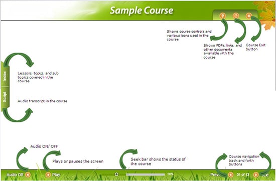
In eLearning, if the learners are not provided with clear navigation buttons to navigate through the course, they might get confused, this might frustrate and confuse them. To avoid this, it’s better to remove the unnecessary buttons from the screen. To help your learners take up the course smoothly, ensure that you specify what each button does clearly. It’s important to explain the navigation buttons clearly as all the learners may not be familiar with them. So, provide clear instructions on navigation, before the eLearning course starts. This allows the learners to use the buttons effectively in the right way and complete the course successfully.
Here is an example, which shows the navigational features of the course clearly.

3. Blurred images
In eLearning, images play a vital role. Images can be used to explain the content in a simple and effective way. Images create an impact on the learner’s mind, very quickly. It important to ensure that the images in your course are clear and not blurred. If the images are blurred, it diverts the attention of the learners.


4. Improper flow of content
In eLearning, it’s important to ensure that content is chunked properly and placed in such a way that it ‘flows’ well. Improper flow of content may confuse the learners and they find it difficult to retain information.
- Firstly, always chunk the content at the course level and then at the screen level.
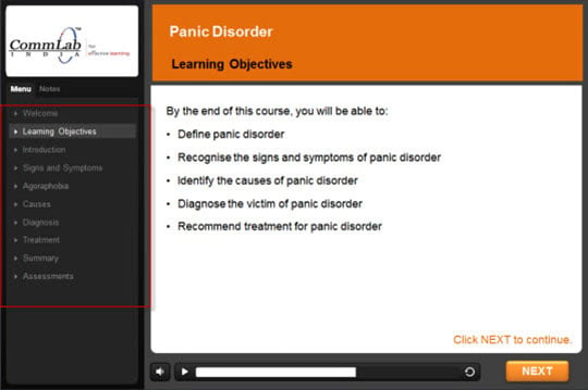
- The best option is to stick to the learning objectives. By this, you can clearly organize the content on the screen and also maintain its flow in a logical manner.
Here is an example of how we structured the course so that each unit reflected the learning objective.

5. No relevance
In the eLearning course, the content must be relevant to learners. They will not pay attention or get connected, if the information is not relevant to them. The content of the course should be learner-centric. They get connected only when they find that the training is relevant to them. To get the learners connected, we can use real images, scenarios, videos, and so on.

6. Take Forever and Ever to Load
In eLearning courses, images and videos play an important role. Videos provide an engaging experience for your learners. But, make sure the images and videos in the course load quickly. The learners aren’t going to wait forever to see them! They may feel frustrated and drop out from the course.
7. Grammatical and Spelling Errors
The instructional designer must make sure that there are no grammatical errors andspelling mistakes. An eLearning course is always expected to be flawless and a small mistake will make your learners lose focus. You can use resources such as SpellCheck.net, to check your spellings.
Now, let’s look at two statements:
“Let’s eat, Grandpa!” and “Let’s eat Grandpa!”
A missing comma can change the meaning completely.
8. Interactions that don’t make sense
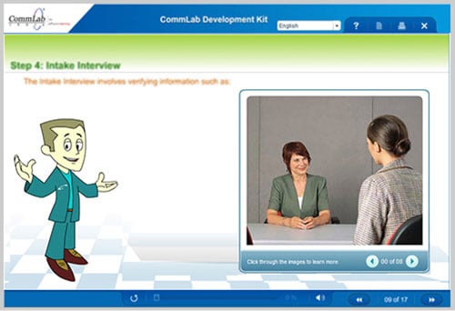
In eLearning, just because the interactive elements can be easily included doesn’t mean we can add whenever and wherever we want. Before adding, the first thing you need to ask yourself is, what is the purpose of this interaction? If the interaction is just for fun, then don’t waste your or your learners’ time. But, if the interaction helps the learners understand a concept better, include it. Advantage of including interactions can be used for engaging the learners’, but should know when to hold back. Include interactivities only when they actually help, support and guide the learner.
Here is an example from one our courses, where we have used click on images because it not only helps the learners remember the concept but also keeps them engaged. This type of interactivity is used to present fact-based information, and this helps the learner to understand the concept easily.

I am sure there are many more things that learners hate in eLearning courses. Please add on to the list.


